
.jpg)
.jpg)
.jpg)
NOTE: This is a collection of information and links collected over the years that might provide useful information. A Safer Company LLC does not guarantee, endorse or approve any of these links or their scripts. Use these links to other websites at your own risk.
Text Typography
Text is the primary way to communicate content on web pages because words are an effective way to communicate. Text can be used for:
- Headlines
- Subtitle
- Captions
- Body copy or content
- Hyperlinks or links
- Navigation menus
- Text based buttons
Text depends on typography which is the art of arranging letterforms in space in any medium in order to communicate a message. Typography is used to create readable and visually interesting text. There are many issues around typography but especially for websites. Websites must be designed for computer screens of various sizes and resolutions, a variety of browsers and platforms (PC or Mac) and available font sets. XHTML and Cascading Style Sheets (CSS) has helped provide effective web typography for cross-platform design.
Good typography can make a web page exciting.
Typeface is a set of characters, usually alphabet letters, numerals, and symbols that follow the same rule in a set. A font is a set of characters within a typeface that has specific characteristics like size or height, weight or darkness and style such as italic or condensed. Fonts belong to a font family.
Here's a list of universally available, fundamental CSS properties upon which great typography can be constructed:
CSS:
- text-decoration (overline / underline)
- font-size
- font-variant (small-caps)
- text-transform (uppercase / lowercase)
- letter-spacing
- font-weight
CSS Pseudo Elements:
- :first-line
- :first-letter
Uses of Fonts
Fonts can be used to create a desired look and feel of a website. They can be used to focus attention on certain text on the screen, enhance readability, set a tone (serious or light-hearted )or project an image (progressive or conservative). Windows and Mac OS have default fonts that are pre installed on the computer and these fonts should be available for displaying text on a web page.
Fonts for Web Pages
Fonts for text items are fairly limited. Web Designers must consider whether the user has the same fonts installed on their computer. Remember that different computer will have different fonts installed.
CSS can be used to set up a font-family so you can have some control on how your web page will look on different computers.
W3School CSS - Web Safe Font Combinations - The font-family property should have several fonts listed in the order of preference. If the browser does not support the first font, it tries the next font, etc. The last font should be a generic font.
 p {
	font-family:"Times New Roman", Times, serif;
 }
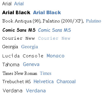
There are only a few fonts that are installed by default on both Windows and Macs computers and are considered to be "browser safe fonts". Web Designers should use the standard fonts for web based text.
Windows Fonts verses Mac
Fonts
Web Page Images
Specialized fonts can be used very effectively to give a certain look and feel to your website. For example, specialized fonts are great for logos. If a specialized font is required for your web page, then the font should be used in a image so it is not dependent on the computer fonts. Getting and Installing Additional Fonts
Note: If you do not purchase a font, make sure it is royalty free. If you purchase a font, make sure you read the licensing agreement carefully.
Font Classifications
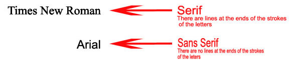
- Serif fonts
- Have lines or feet at the ends of the strokes of the letter.
- Research indicates that serif fonts are used to make long bodies of text like paragraphs easier to read because the line at the top of serif letters creates an imaginary line a the top and bottom of the text line making it easier to read.
- Sans serif
- Sans means "without", so sans serif fonts are without the lines or feet
- Considered easier to recognize
- Many people feel that sans serif fonts are easier to read on web pages.
It is acceptable to use both types of fonts on web pages, but it is not at good practice to use too many different fonts on a single page. Always test for readability and legibility on the web page. Some say that Georgia (a serif font) and Verdana (a sans serif font) are easier to read than the commonly used Times (a serif font) and Arial (a sans serif font).
Horizontal Spacing
The horizontal space needed for a letter is referred to as mono spaced verse proportional fonts.
Mono spaced fonts - each character takes the same amount of horizontal space. NOTE: rarely used on web pages.
Proportional fonts - each character takes
a varying amount of horizontal space. NOTE: Web pages usually use proportional fonts.
For example the "i" does not
need as much space as a "w".
Style
Applying a style to a word or phrase will draw attention to it. There are many ways to emphasize a word or phase or to set the specific text apart from the other text the screen.
- Bold
- Italics
- Underlining - underlining should only be used for hypertext links on web pages.
- Case of the word effects readability
- sentence case - the first word begins with a capital letter
- title case - Each word begins with a capital letter
- lowercase - no word begins with a capital letter
- uppercase - all words are in capital letters - should be avoided because it reduces the readability of the text
- Size - fonts are measured in point sizes.
| Use | Point Size Guidelines |
|---|---|
| Headings | 14 - 48 |
| Subheadings | Half the heading size, with a minimum that is not smaller that the body text |
| Body text | 10-12 |
- Font sizes may look vary on different computer monitors because of the screen resolution or operating system or PC or Mac.
- It is important to test
your web site on the following
- different monitors with different resolutions
- Computers - PC vs Mac
- Operation systems - Windows XP or Windows 7, etc
- Browsers
- Exercise restrain and do not use too many different fonts or styles
- Be consistent between web pages
Spacing
- Kerning and tracking
- Leading - the amount of space between lines of text.
- CSS
p {
letter-spacing: 12px;
line-height:12px;
} - Relative or absolute length units. - Length units is the length of an object.
- Relative length - length of the object relative to another property such as the size of the font. - Best for web design
- Absolute length - units are dependent of the viewing medium (for example: monitor resolution)
- CSS
Color
Good typography depends on the visual contrast between fonts and the body space and the white space. The layout is the first thing a visitor notices on a web page.
Alignment
Layout and alignment are important typographic considerations.
Line Length
Make sure the lines of text are not too long. Long lines are difficult to read.
CSS
CSS can make the typography easier to change on web pages.
Page last updated: May 31, 2012 10:16 AM
Content and Navigation...